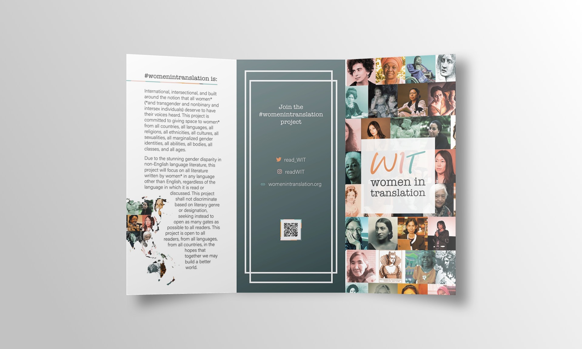
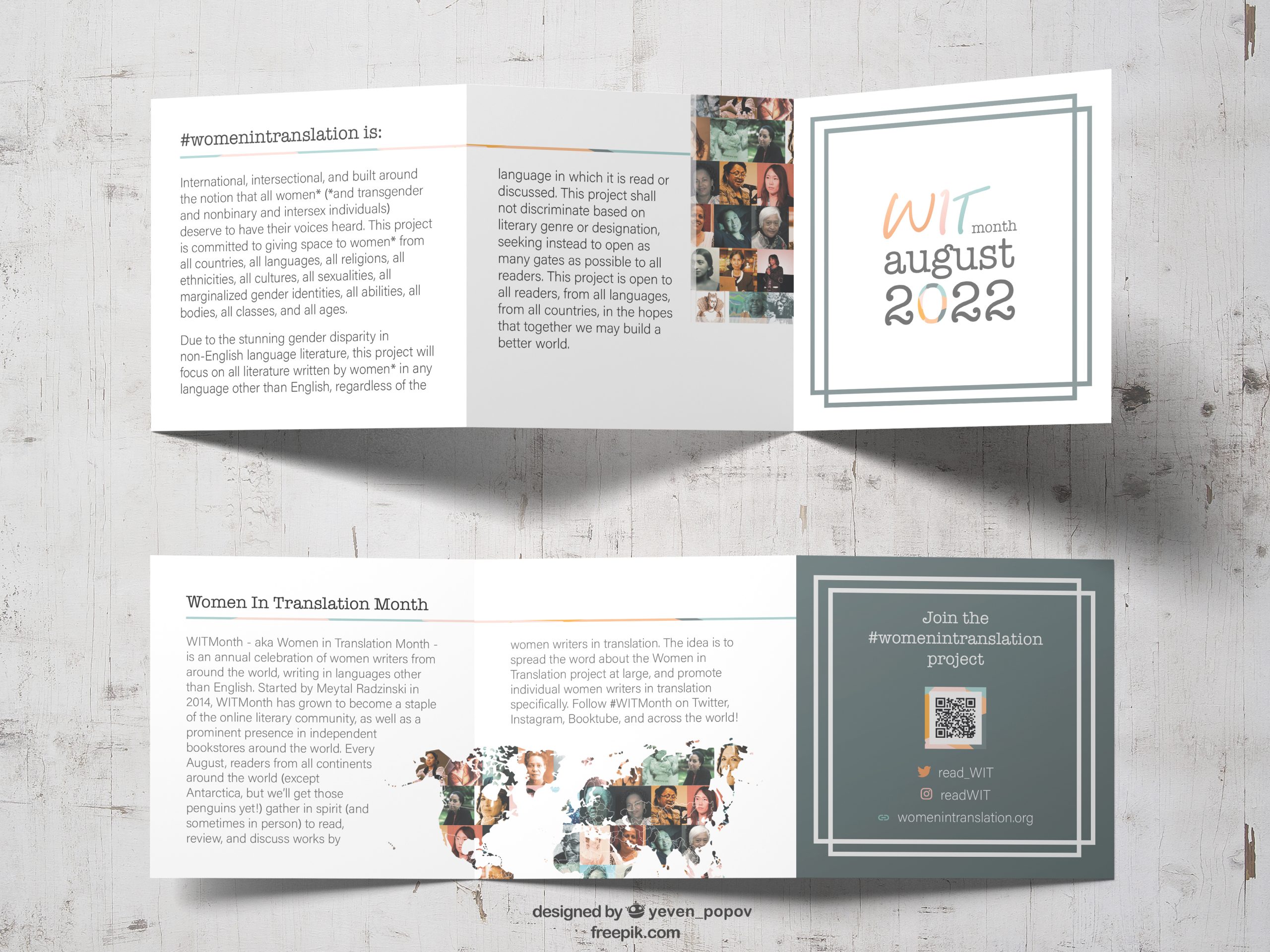
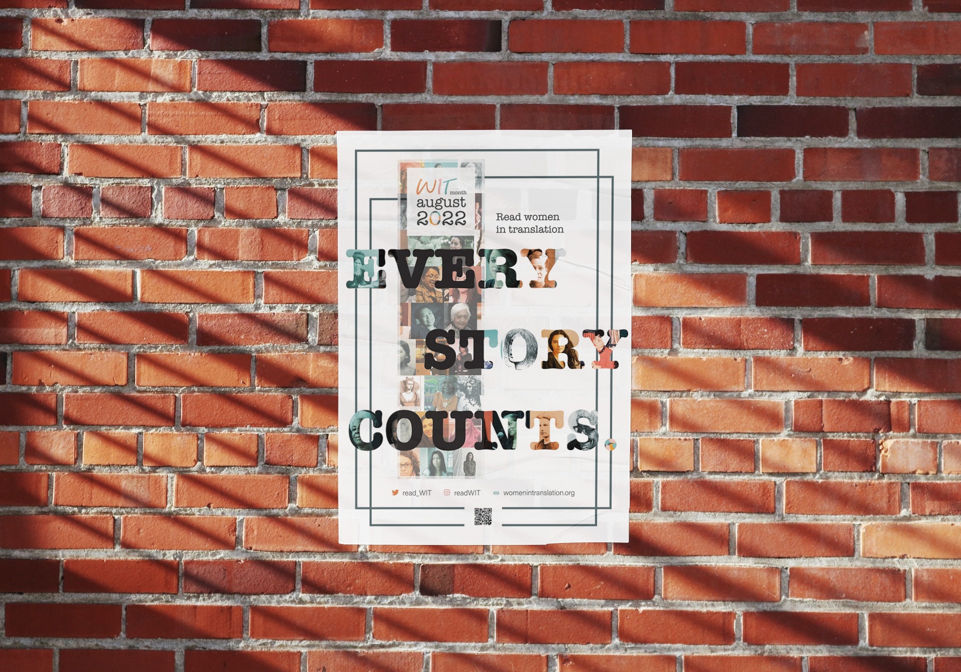
The Women In Translation (WIT) project is an online movement to raise awareness and celebrate works of literature written by women and translated into English from all over the globe. As part of this movement, WIT Month is a yearly event that takes place online every August, in which people share book reviews, games and discussions about literature, inclusivity and the joy of reading.
The Logo
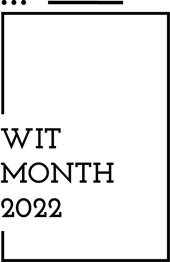
As the WIT project is all about reading and writing, the logo I created was typographic: I used a font I modified that looks like feminine handwriting next to a font that resembles a typewriter printout, to represent the literature created by women. In addition to two forms of the main logo, I also designed a secondary logo to lead the yearly event of WIT Month, that would be integrated in social media posts and merchandise.
Previous
Next
The Colors
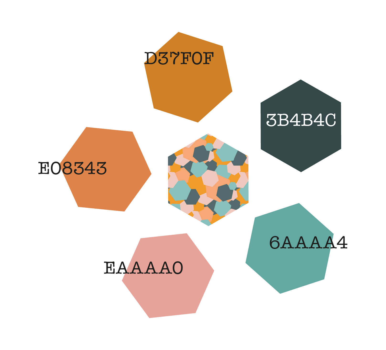
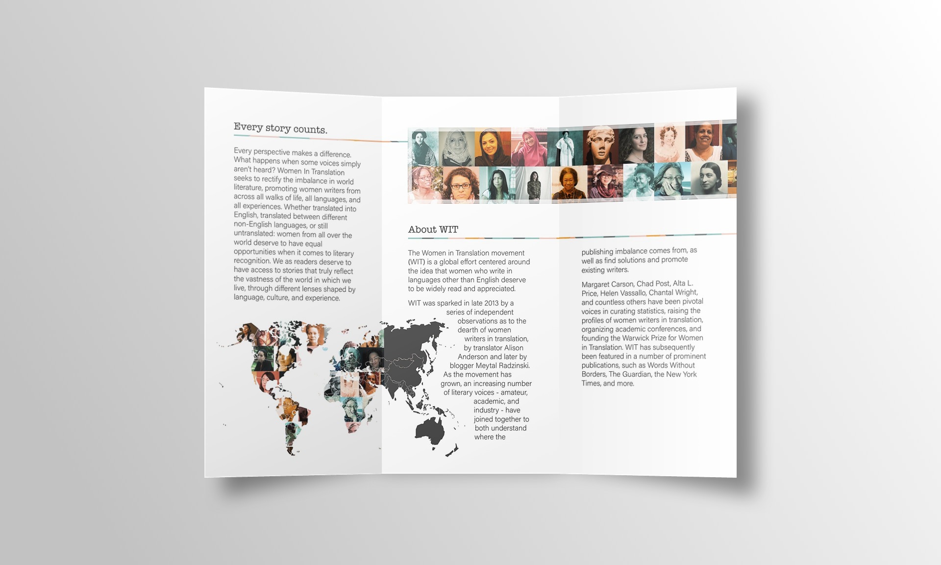
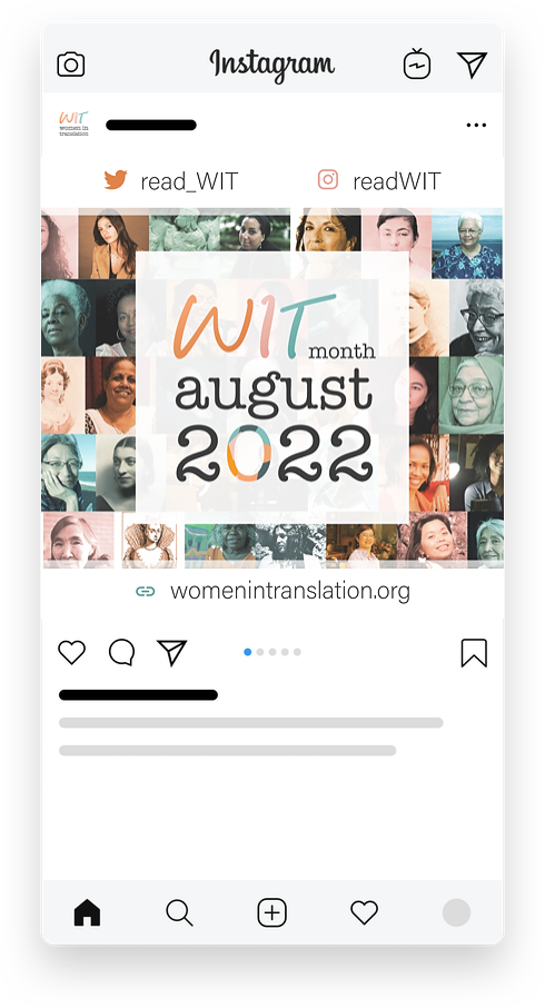
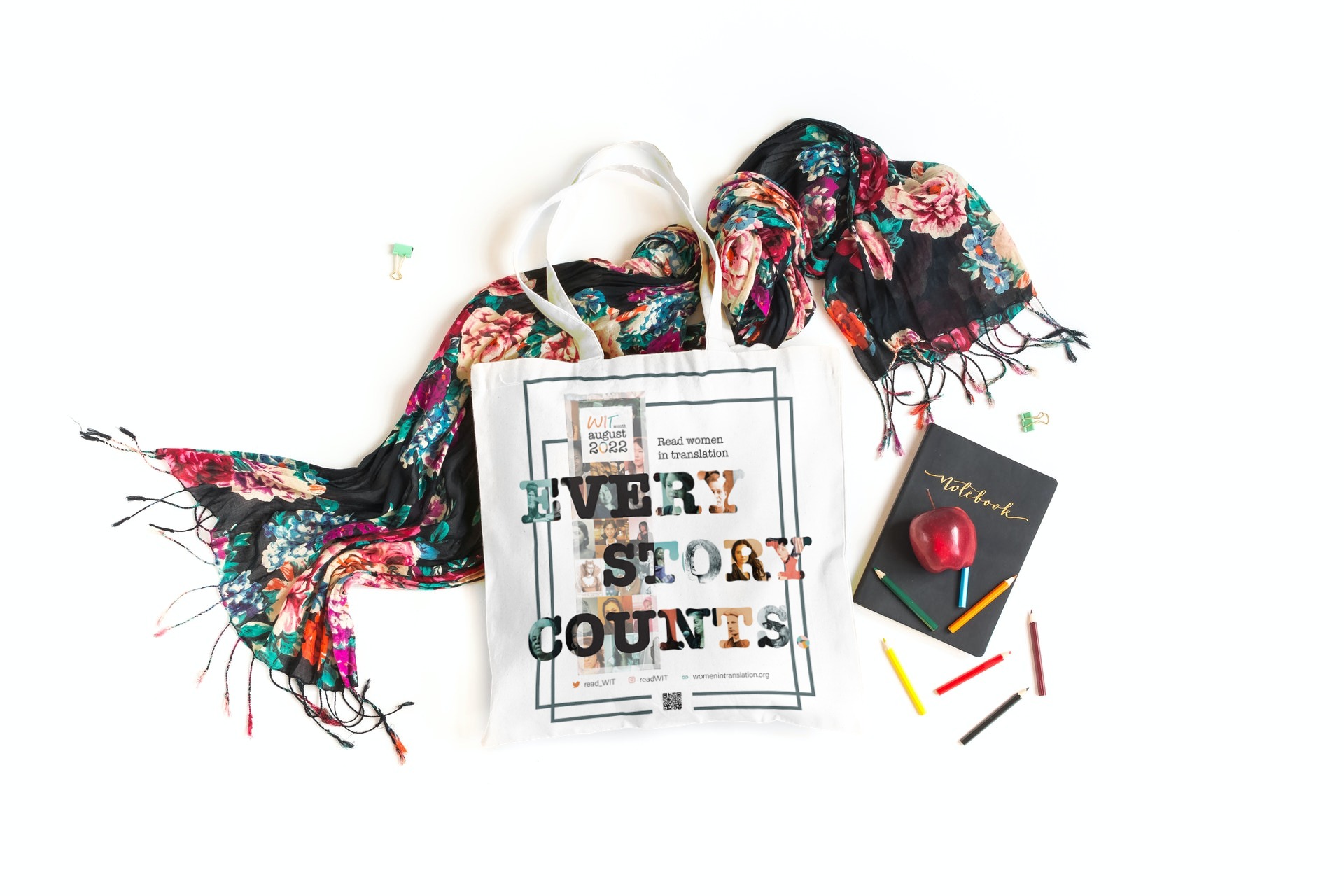
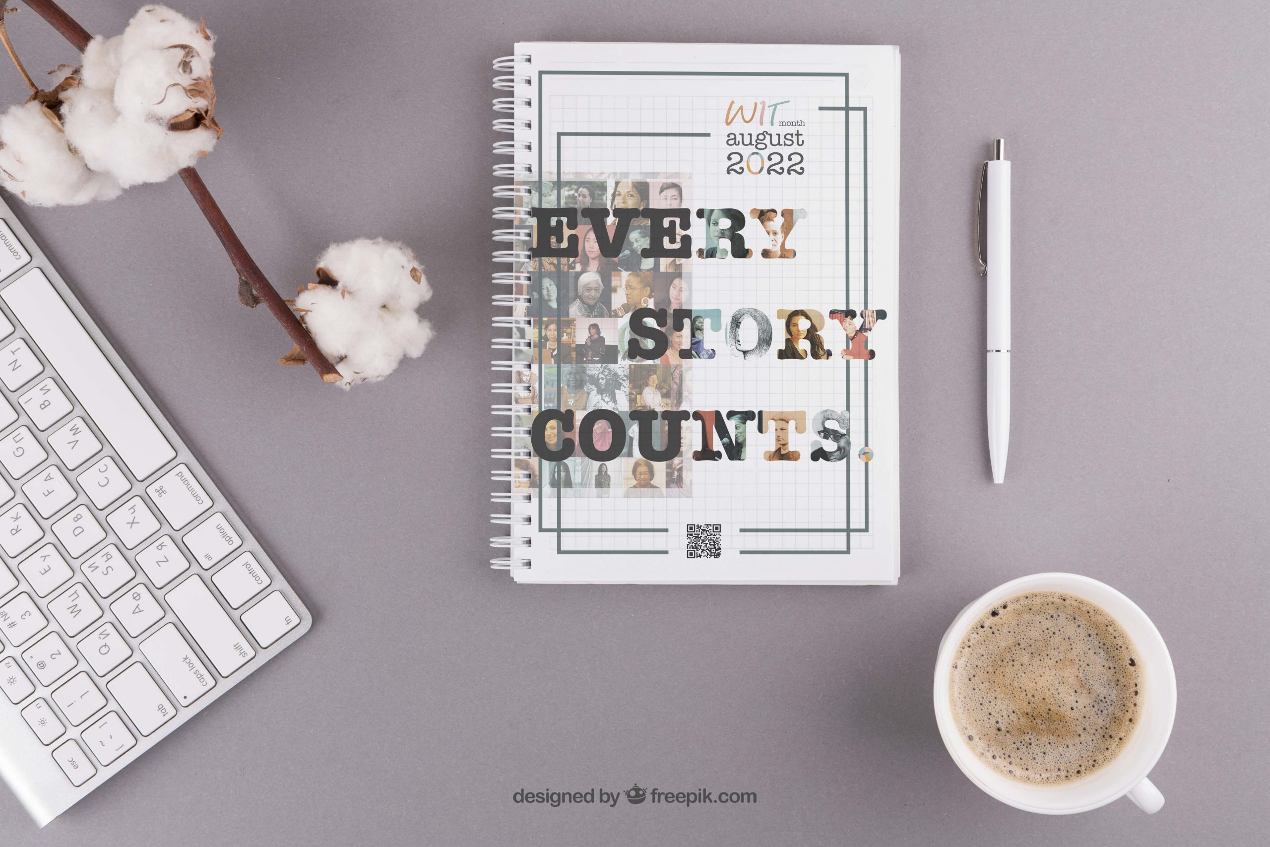
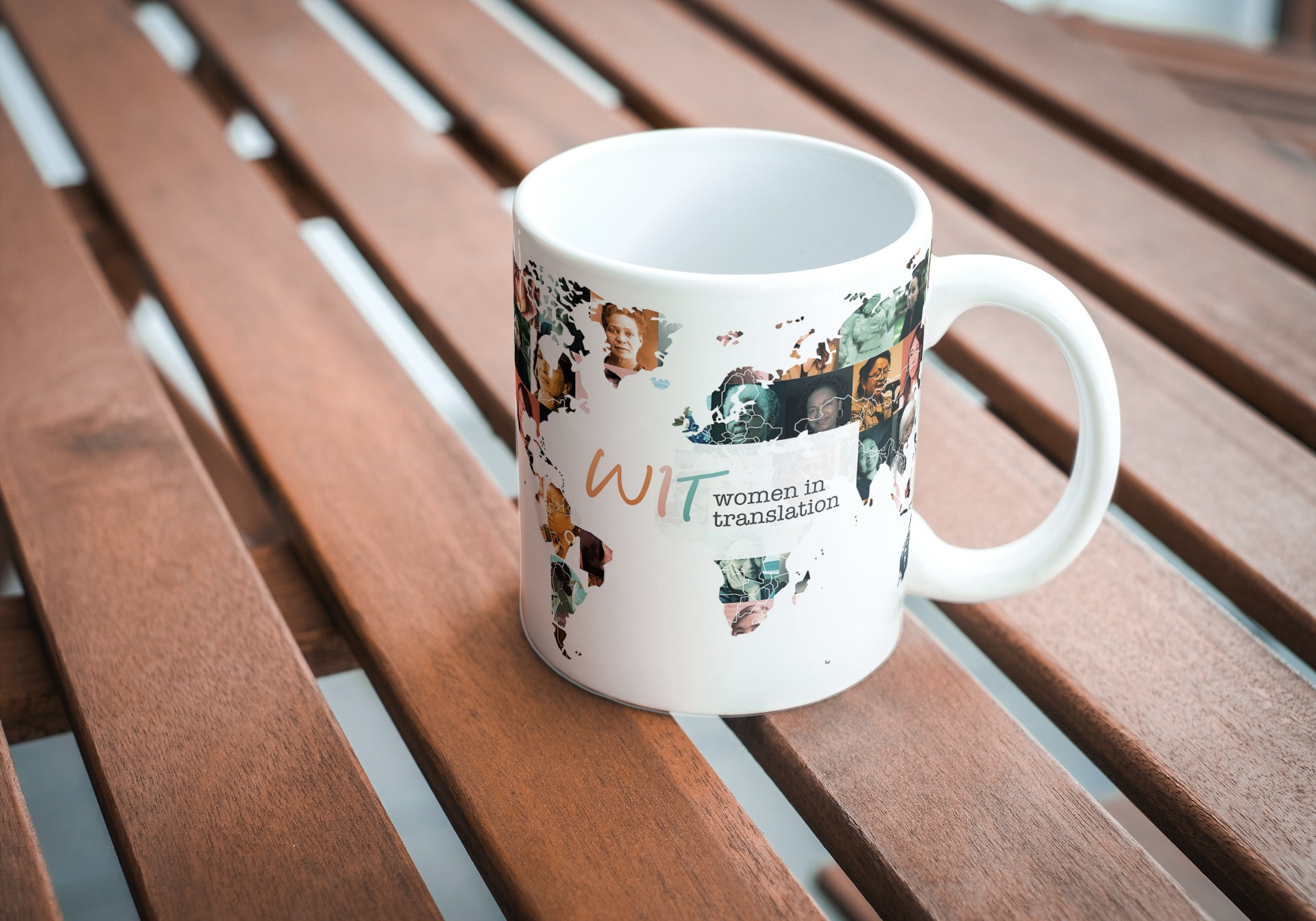
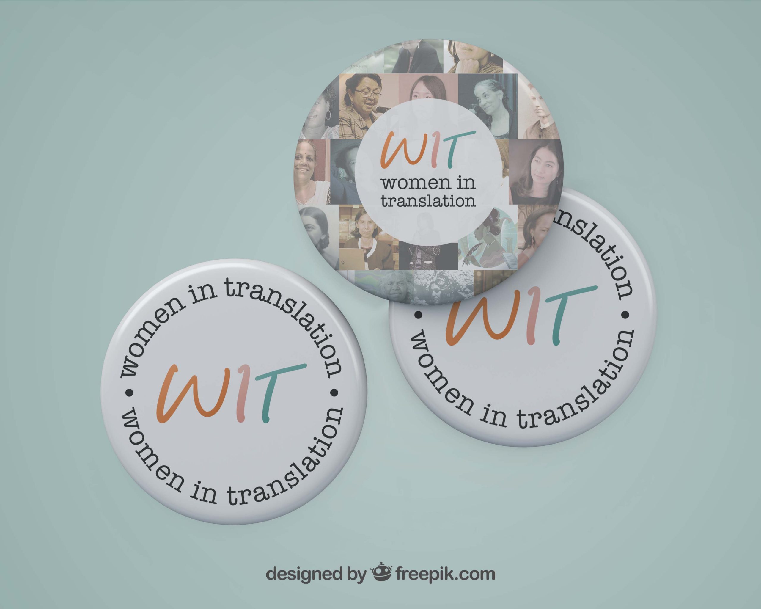
In forming the palette of colors for this brand, I used the existing blues of the WIT website as a starting point. I modified them slightly and added complementary oranges and pink, which would together speak femininity with the warmer hues, and a thirst for widening horizons with the cool hues. I also created the colorful mosaic pattern to represent the diversity and inclusivity the WIT project celebrates.
The Colors
In forming the palette of colors for this brand, I used the existing blues of the WIT website as a starting point. I modified them slightly and added complementary oranges and pink, which would together speak femininity with the warmer hues, and a thirst for widening horizons with the cool hues. I also created the colorful mosaic pattern to represent the diversity and inclusivity the WIT project celebrates.
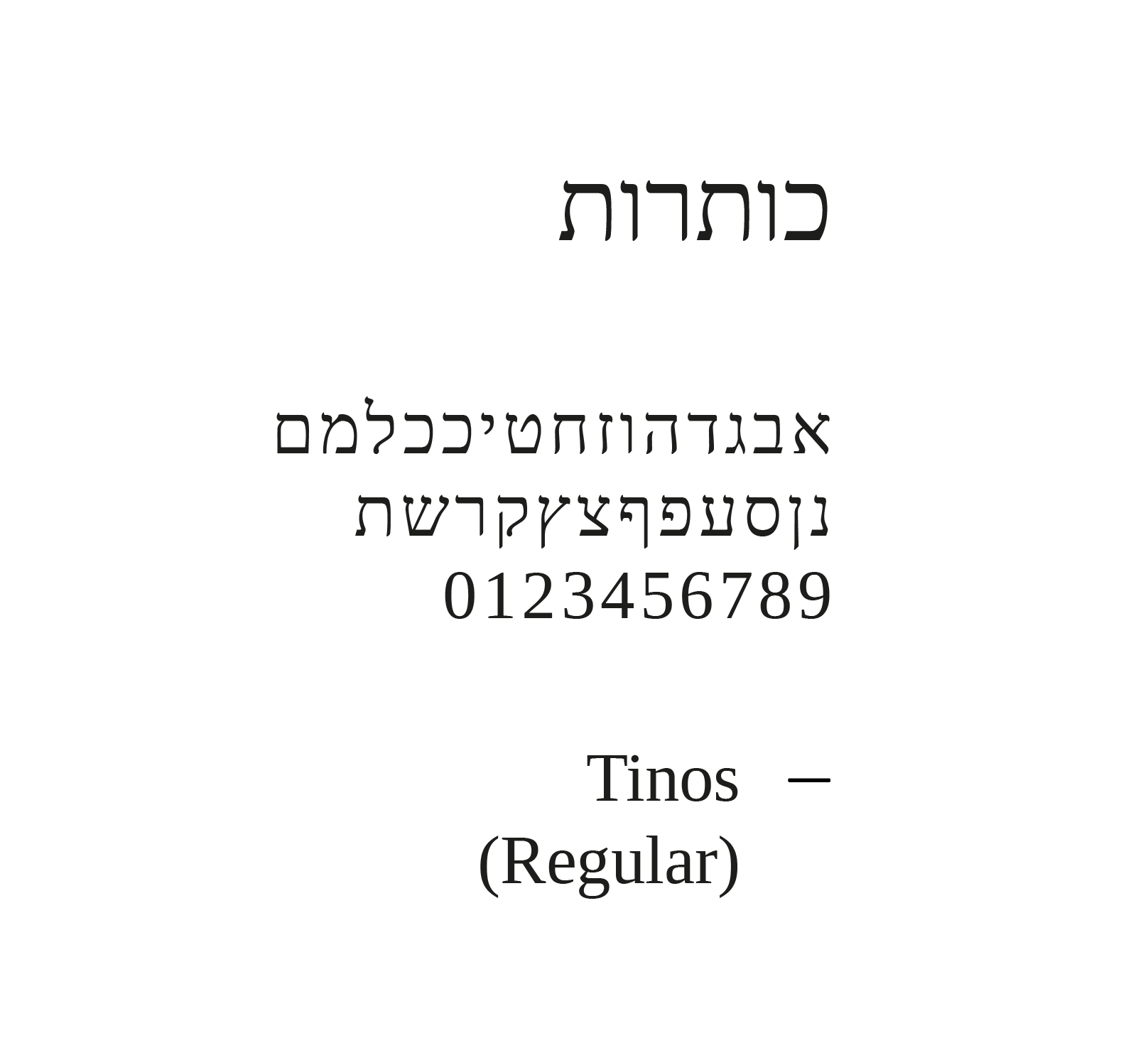
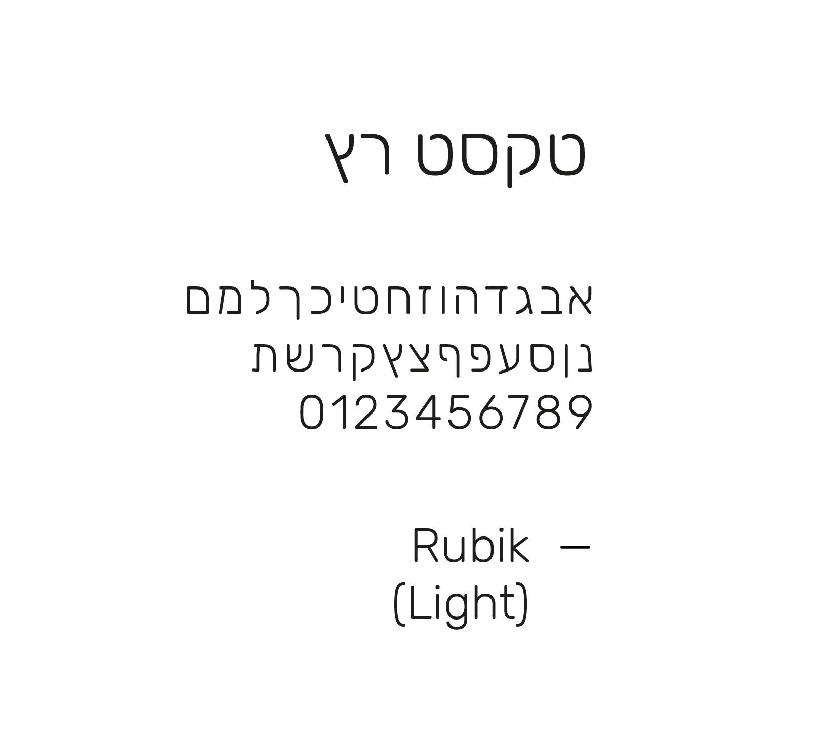
The Fonts
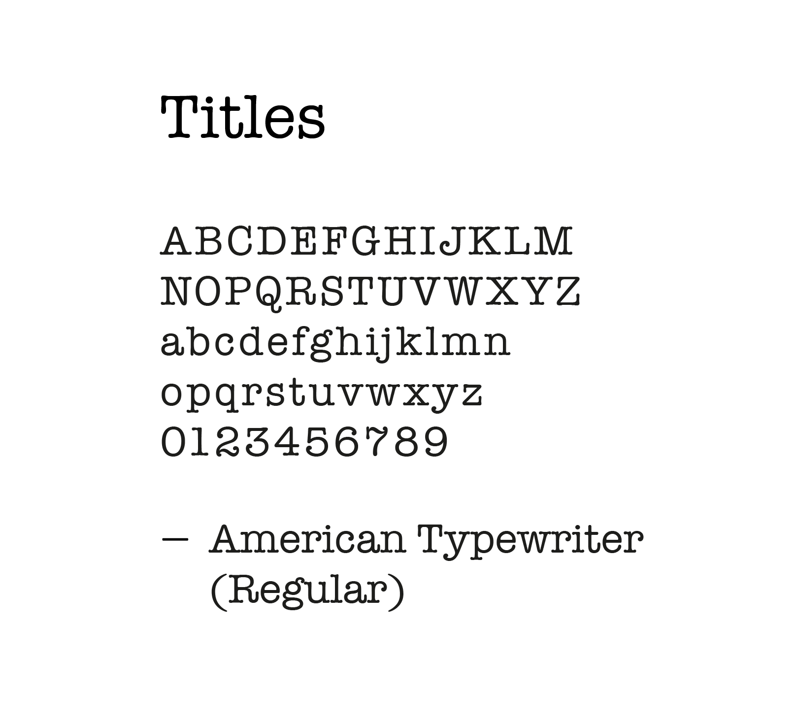
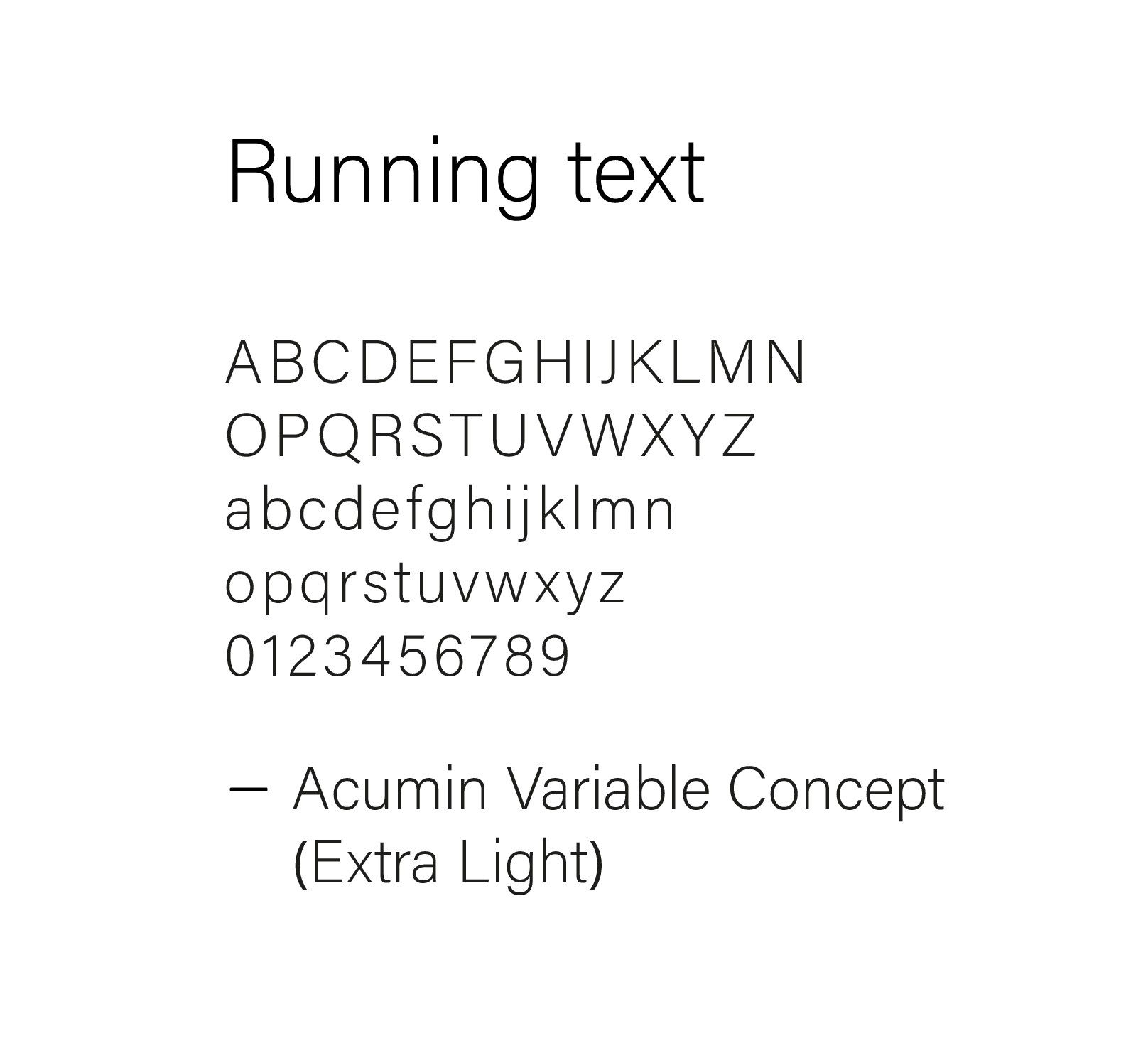
For titles I used the same elegant typewriter font seen in the logo. To contrast it, the running text is a clean sans serif that is readable and easy on the eyes.
Previous
Next
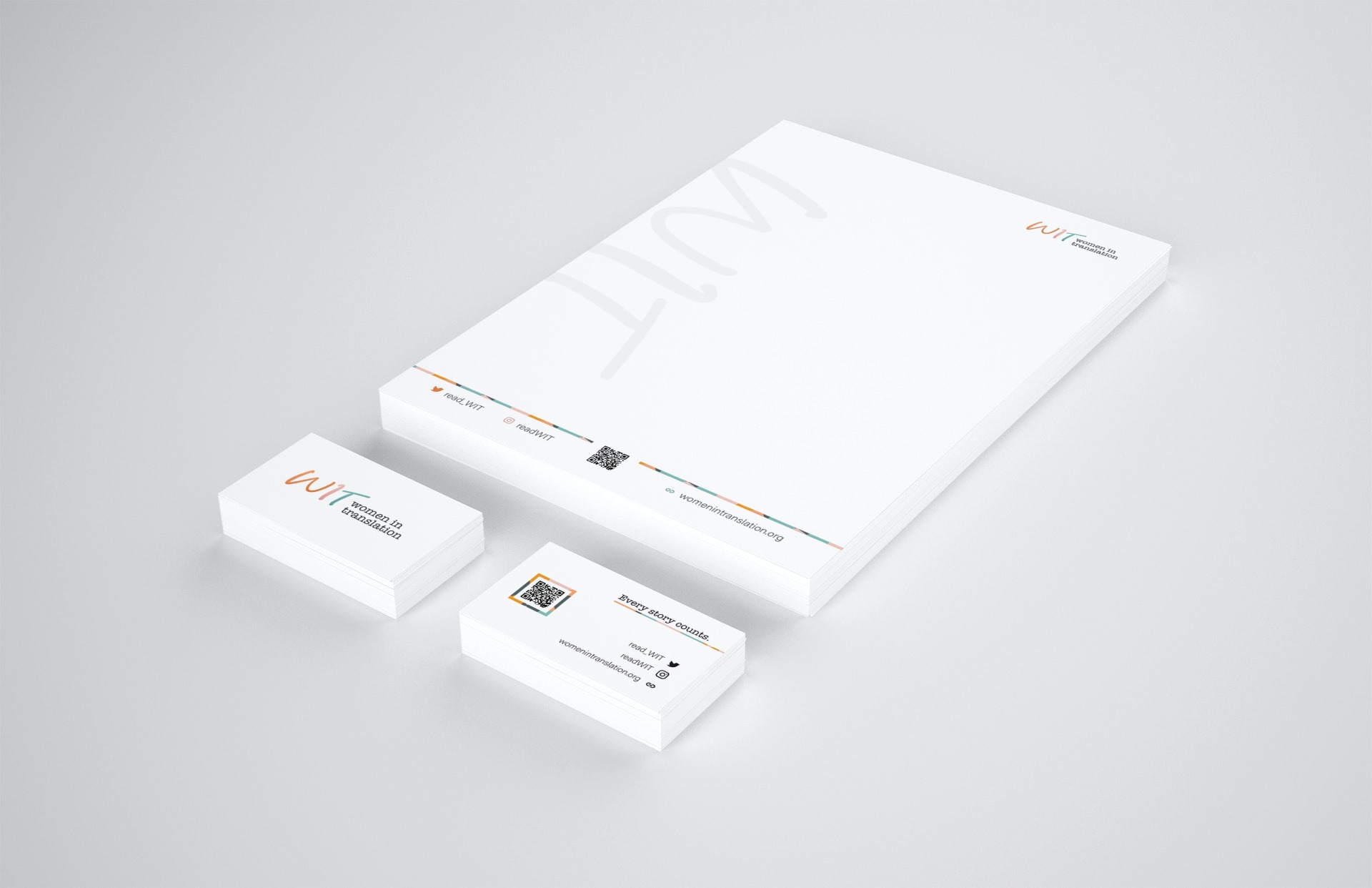
WIT stationary and business card
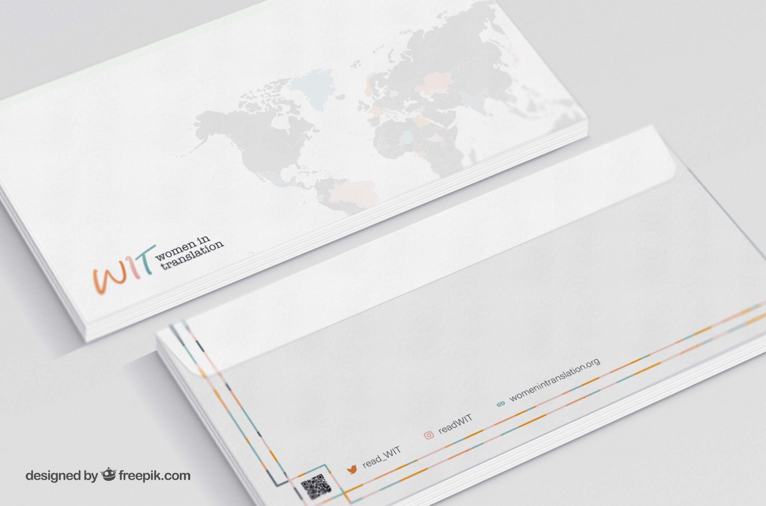
WIT envelope
WIT brochure outside
WIT brochure inside
WIT square brochure
WIT poster
WIT instagram post
WIT tote bag
WIT notebook
WIT mug
WIT pins
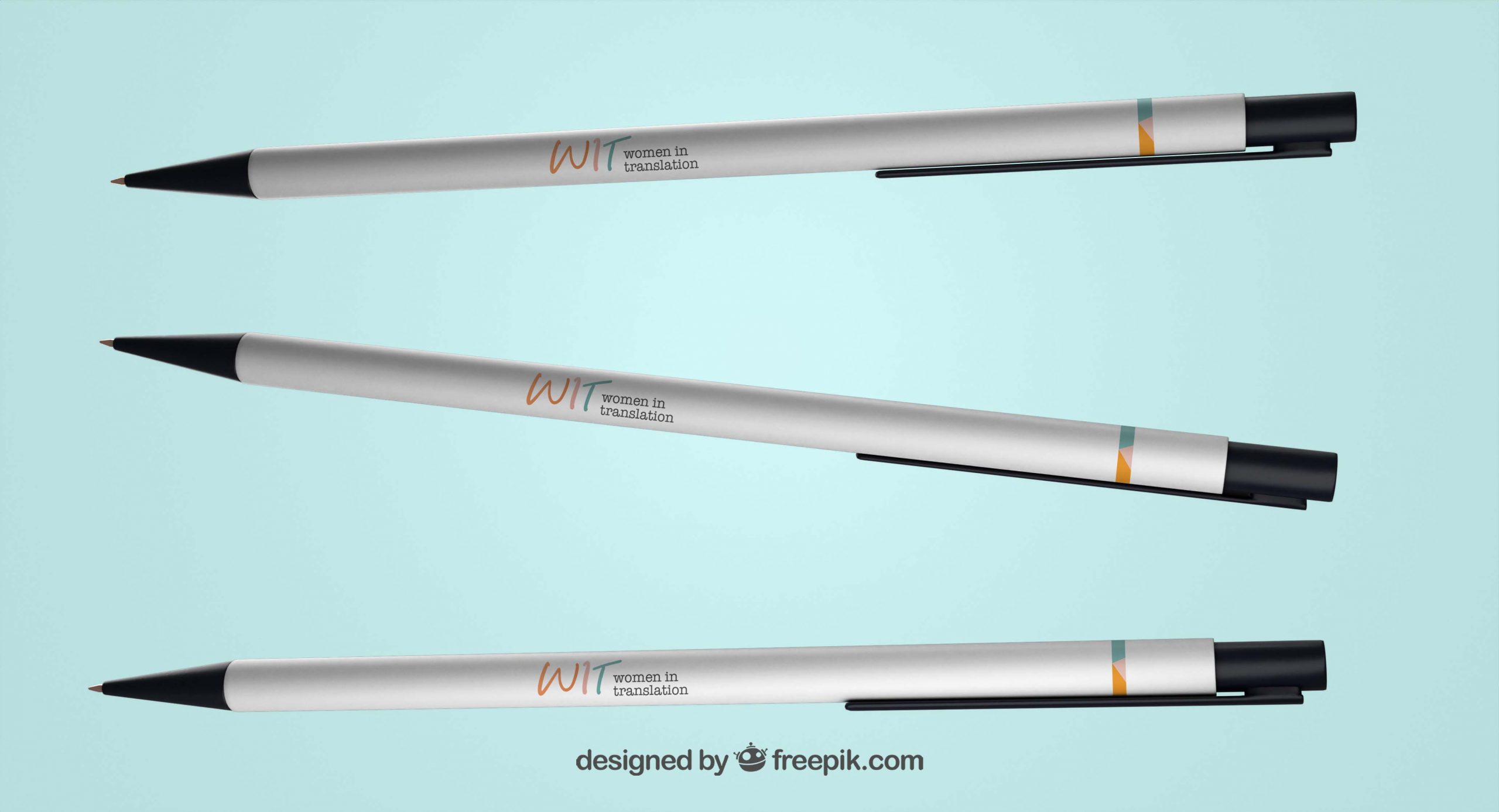
WIT pens
World map SVG created by Al MacDonald. website / twitter


 Skip to content