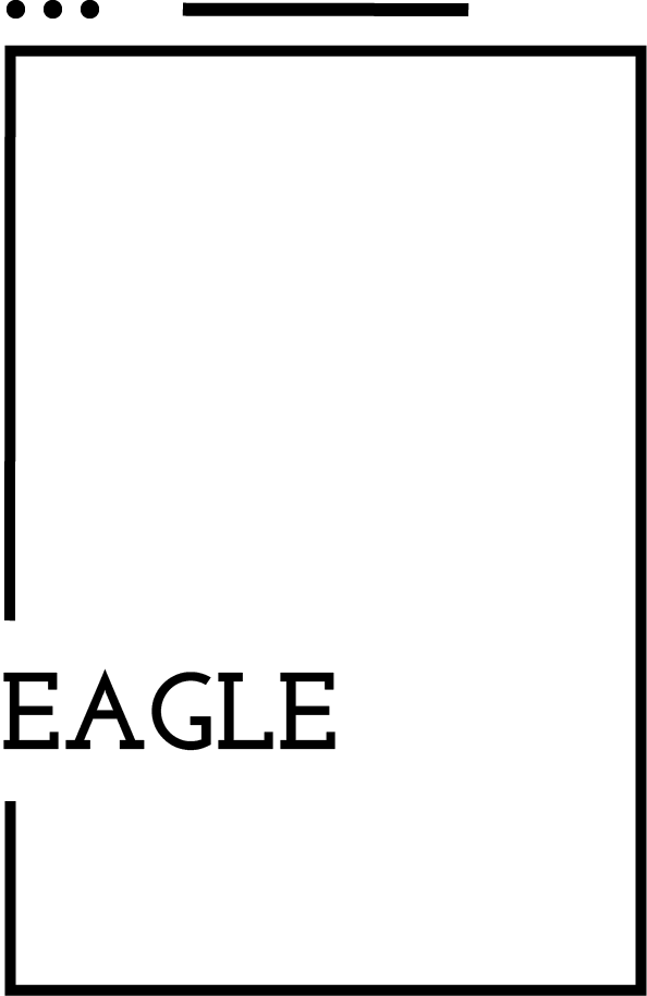
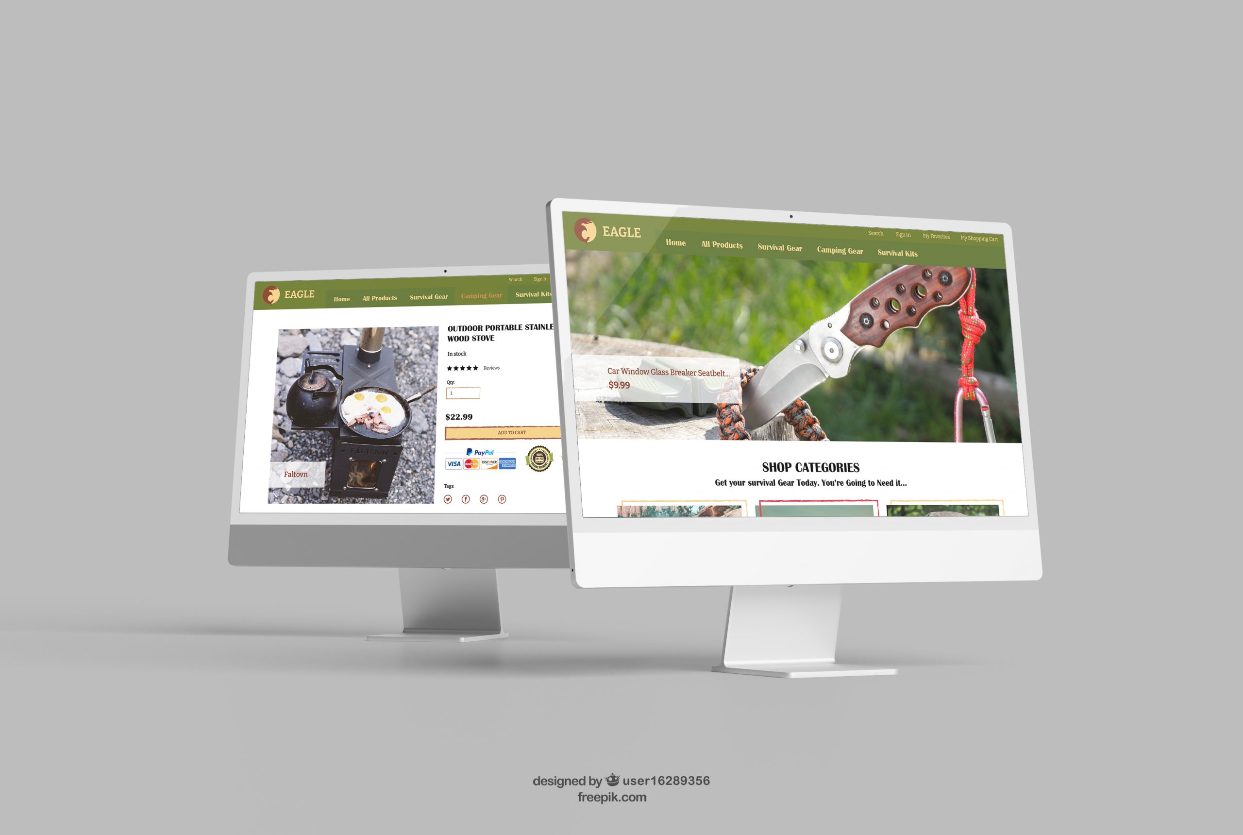
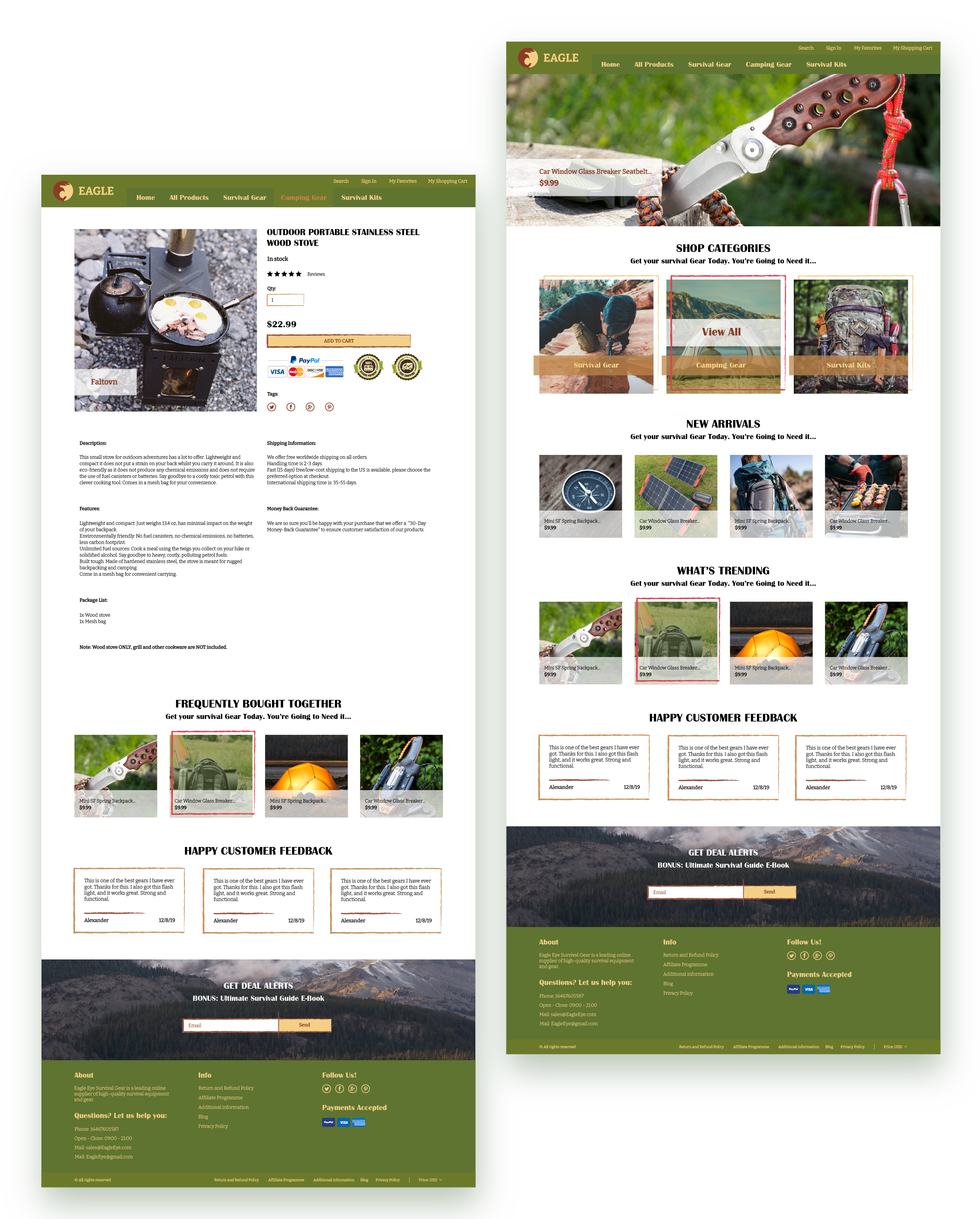
Eagle is a fictional online shop for survival and camping gear. Using existing UX frames that were given to me for this exercise, I attempted to create a clean, appealing look that would also turn to the shop’s target audience: campers and survivalists, ready to explore the outdoors.
The Logo
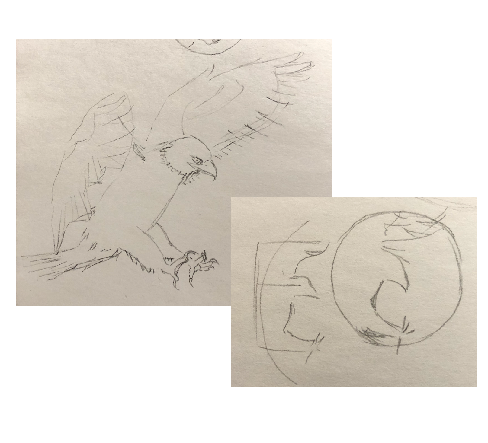
In looking for inspiration for the logo, I went with the name of the brand and wanted to find a way to integrate the form of an eagle into a symbol. Through observing many photographs and redrawing some of them, I found that the powerful pose of an eagle in flight can resemble the letter E. From there, I recreated the eagle’s shape in Illustrator to form the final logo.
Previous
Next
The Colors
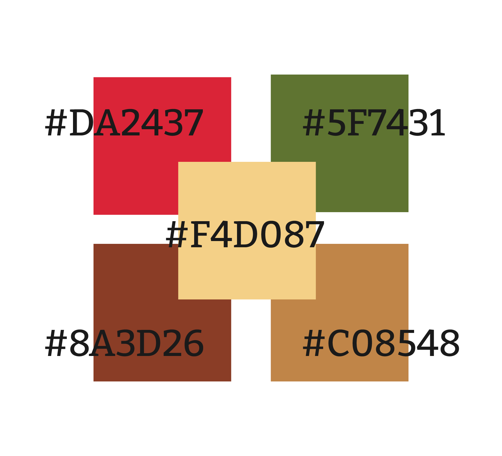
For this brand I chose shades of brown to represent the earth and the roads one would walk on a journey in the outdoors, forest green for the nature that surrounds the trails, and a lively red to contrast the green and draw attention to important locations.
The Colors
For this brand I chose shades of brown to represent the earth and the roads one would walk on a journey in the outdoors, forest green for the nature that surrounds the trails, and a lively red to contrast the green and draw attention to important locations.
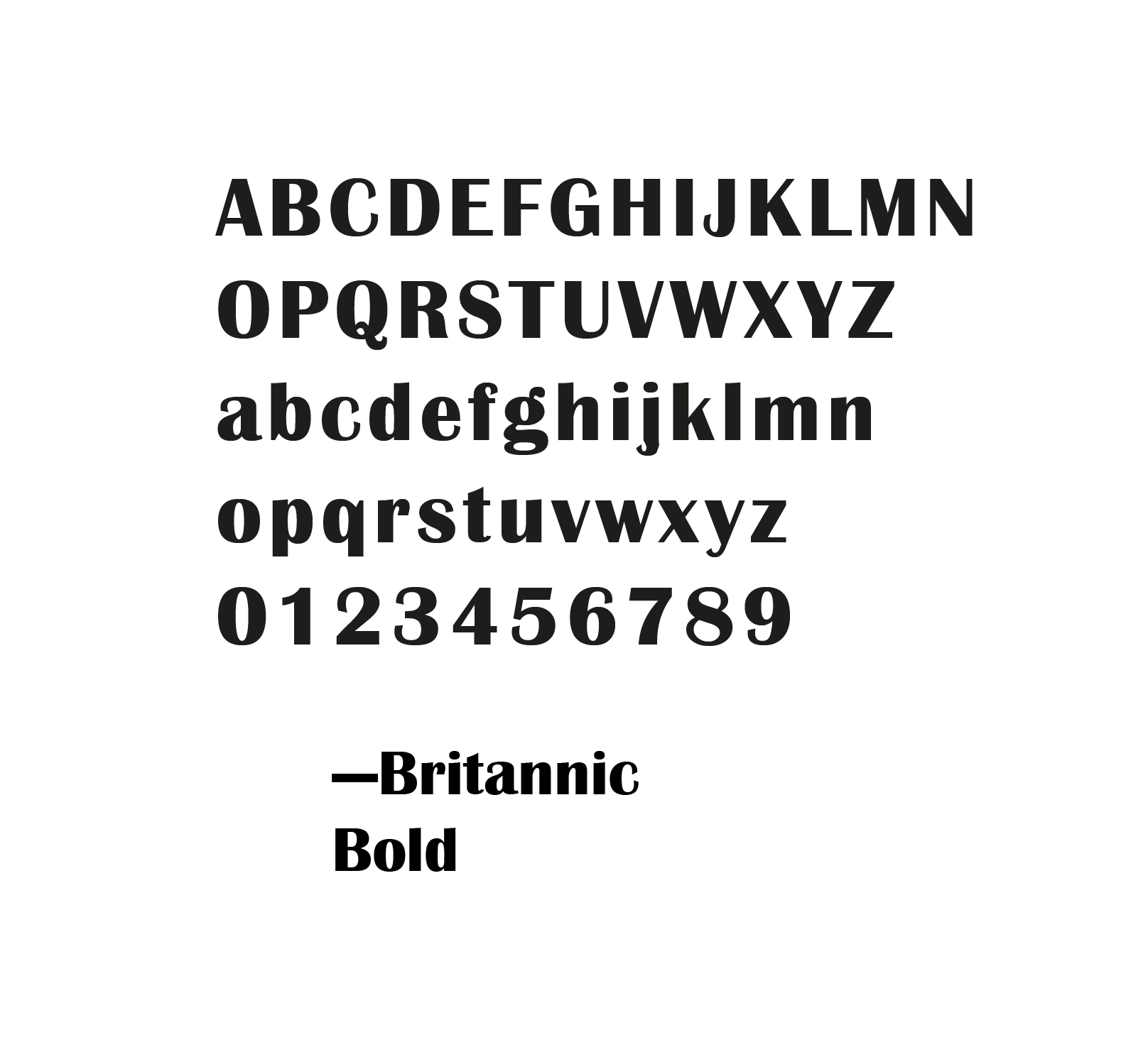
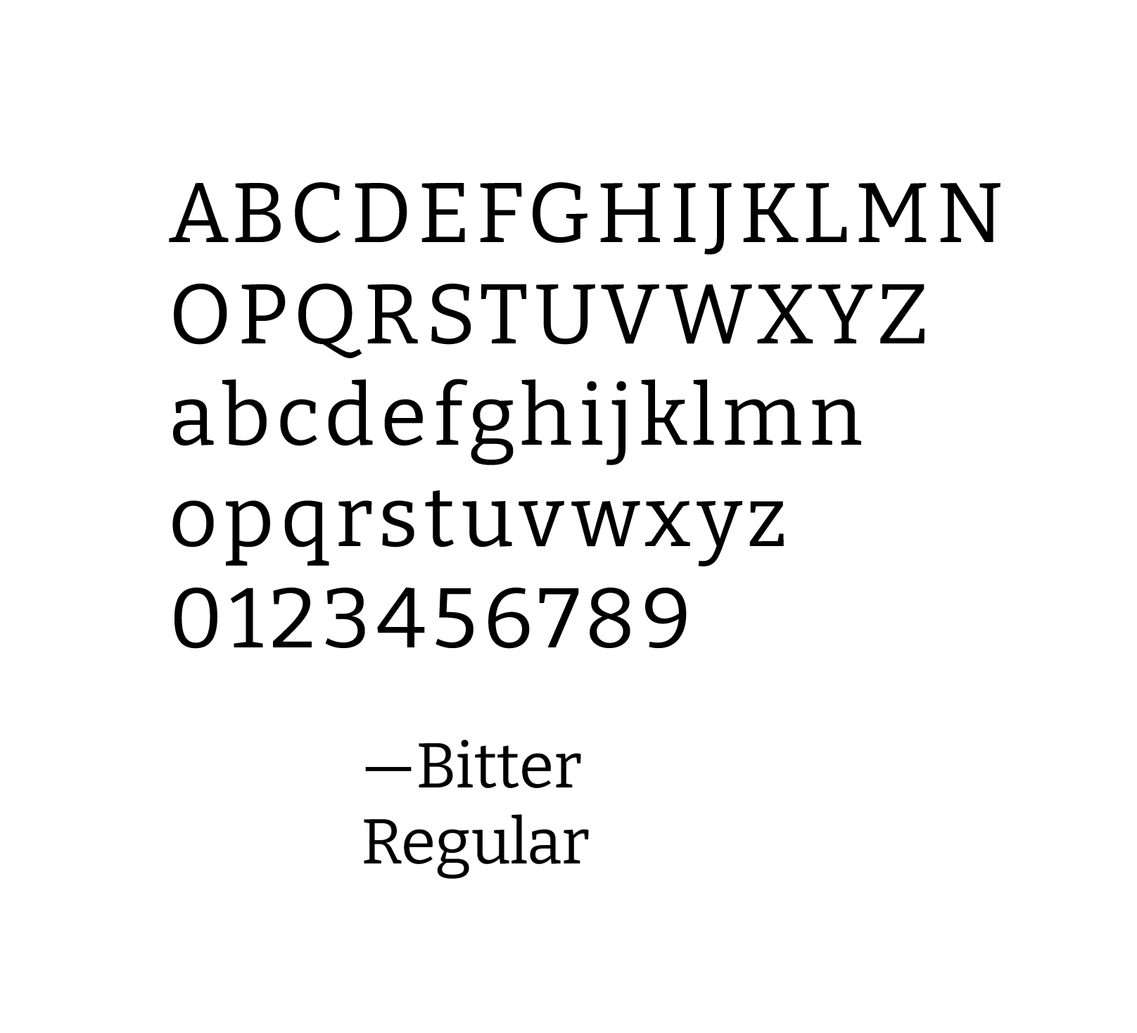
The Fonts
Lorem ipsum dolor sit amet, consectetur adipiscing elit. Ut elit tellus, luctus nec ullamcorper mattis, pulvinar dapibus leo.


 Skip to content